Pai Skincare
Spring & Summer 2020
Packaging, primary
Art Direction — Alley Kurgen
Studio — Concrete
Client — Pai Skincare
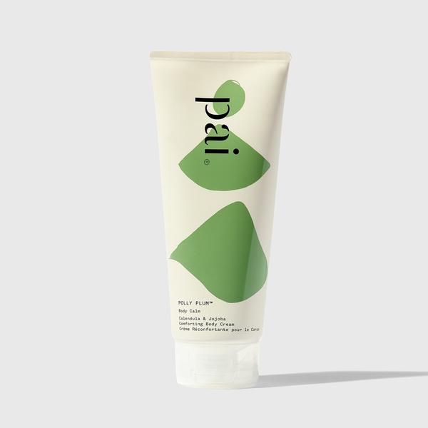
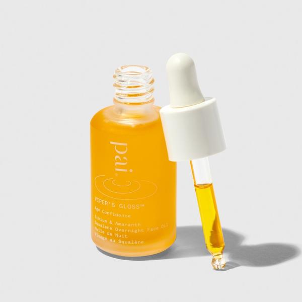
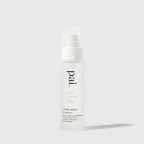
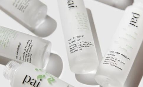
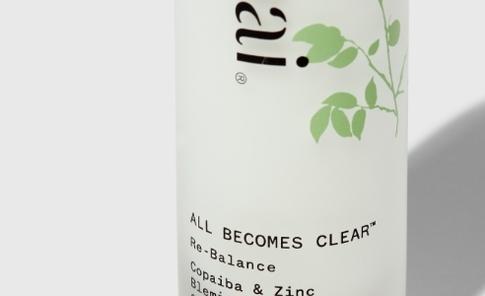
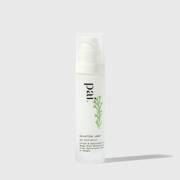
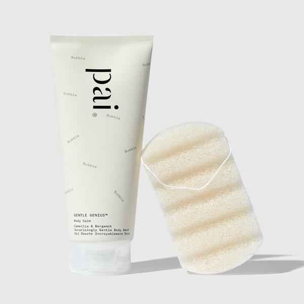
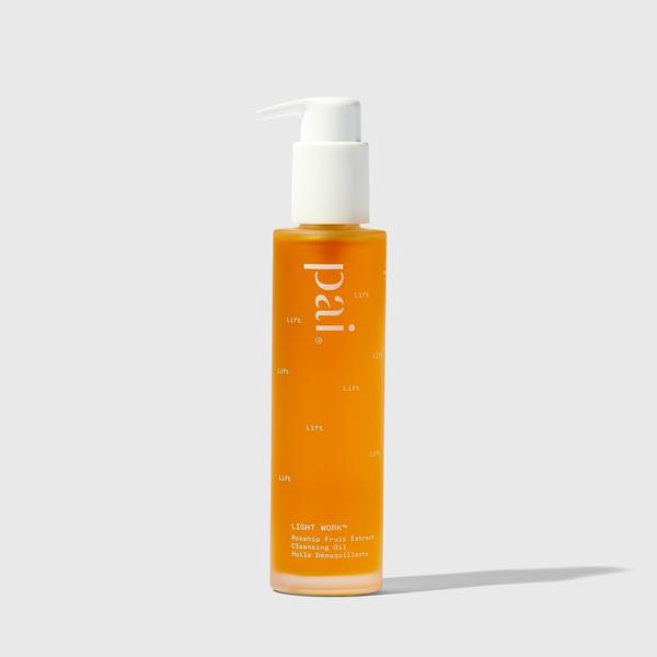
I joined the Pai Skincare team at Concrete to help create the illustrations and other packaging details. Pai has a broad range of skincare products, and they wanted it to be easy for consumers to visually distinguish their favourites. We created individual illustrations for each product so a customer can quickly recognise their choice.
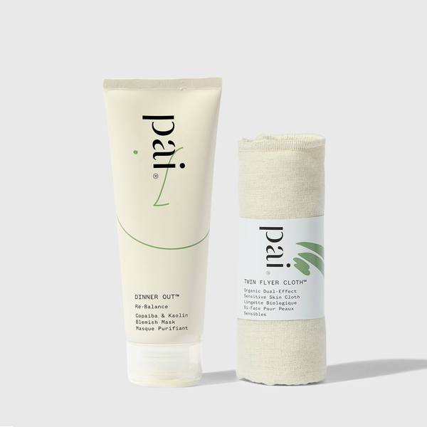
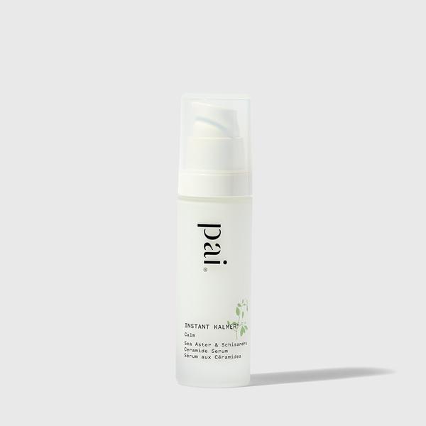
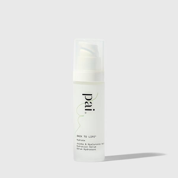
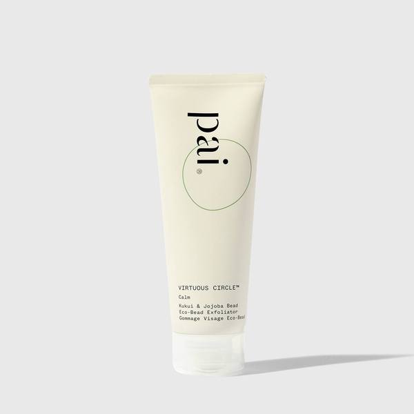
The client also wanted a secondary symbol that could work in coordination with the Pai logo. We created the patch test symbol to meet that request. It is a letter P for both Pai and patch test, and the dots embrace the action of patch testing.
